|
Director's
Commentary
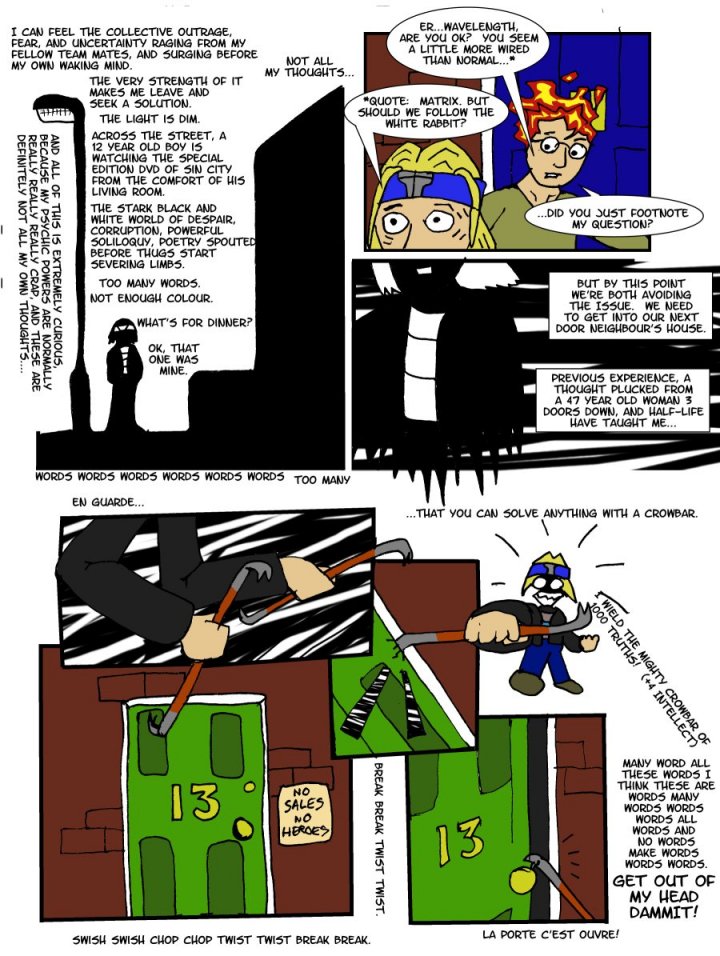
I am
a big fan of Frank Miller's Sin City, not because of the mindless
"artistic" violence, but because of the effectiveness
of the simple black and white style of the whole comic. It even
shows through in some of his other work, in particular the Batman
work that he did. Even using colour, it's clearly the same sort
of style, with strong contrast and simple use of shadows to create
a mood.
I suppose
it's a no brainer to say that what would work in Basin City would
work in Gotham City. Maybe, one day, when I grow up into a proper
comic book artist, I'll be able to bring the same sort of effective
contrasting colours and mood to the mean streets of Harringay.
Until
then, we'll have to stick to the half baked lazy-methods I normally
use.
Coming
soon, keep your eyes open for some comics that I've been using
a tablet for. The next page should feature some tablet work anyway.
It's a bit of a learning curve so far, but there we go.
|